Feature improvement for increased user engagement.
A mobile design project
The Challenge
To preserve and increase users after the covid epidemic disrupted the sports world, theScore sports app is looking to update and increase their content, format and innovations.
The Hypothesis
Add extensive athlete “biographies” to update theScore’s content and enhance user engagement.
Background
I use theScore often and was inspired to improve the product and user experience while designing according to an established brand.
Initial research to understand their current business situation and future goals established the following:
TheScore’s mission:
Create mobile-first sports experiences by “delivering sports fans the ultimate, personalized mobile experience.”
TheScore wants to update and increase their content, format and innovations to preserve and increase users after the covid epidemic disrupted the sports world.
Due to this disruption, the total revenue for the theScore was down by over half from 2019.
*theScore's F2020 Q4 and Year-End results as delivered on October 28, 2020.
The path to a solution
I tested the hypothesis with sports app users during the empathize stage following a user centered design process.
I then proceeded through the define, ideate, prototype and test stages to design and implement a new feature to increase user engagement.
What do the users want?
Using a Google survey I wanted to find out the following from sports fans.
Feedback regarding my initial hypotheses of new feature options.
What media do they use to watch and follow sports?
Participants
18 male participants
18-54 years old
time limitations prevented continuing the survey for female participants
What other possible features they expect and want from a sports app?
Why do they use sports apps?
Survey highlights
Reasons for reading athlete biographies:
Get to know players.
Find out about new players.
More interesting than information shown on TV.
Helps with Fantasy decisions.
Key takeaways following an analysis of the top 5 sports apps by downloads.
Similar features, functions and coverage of world wide sports.
Some apps not very intuitive and have crowded and confusing layouts.
Limited “personalization” options.
Limited athlete information.
Conclusions
“Users would like an additional feature of athlete biographies.”
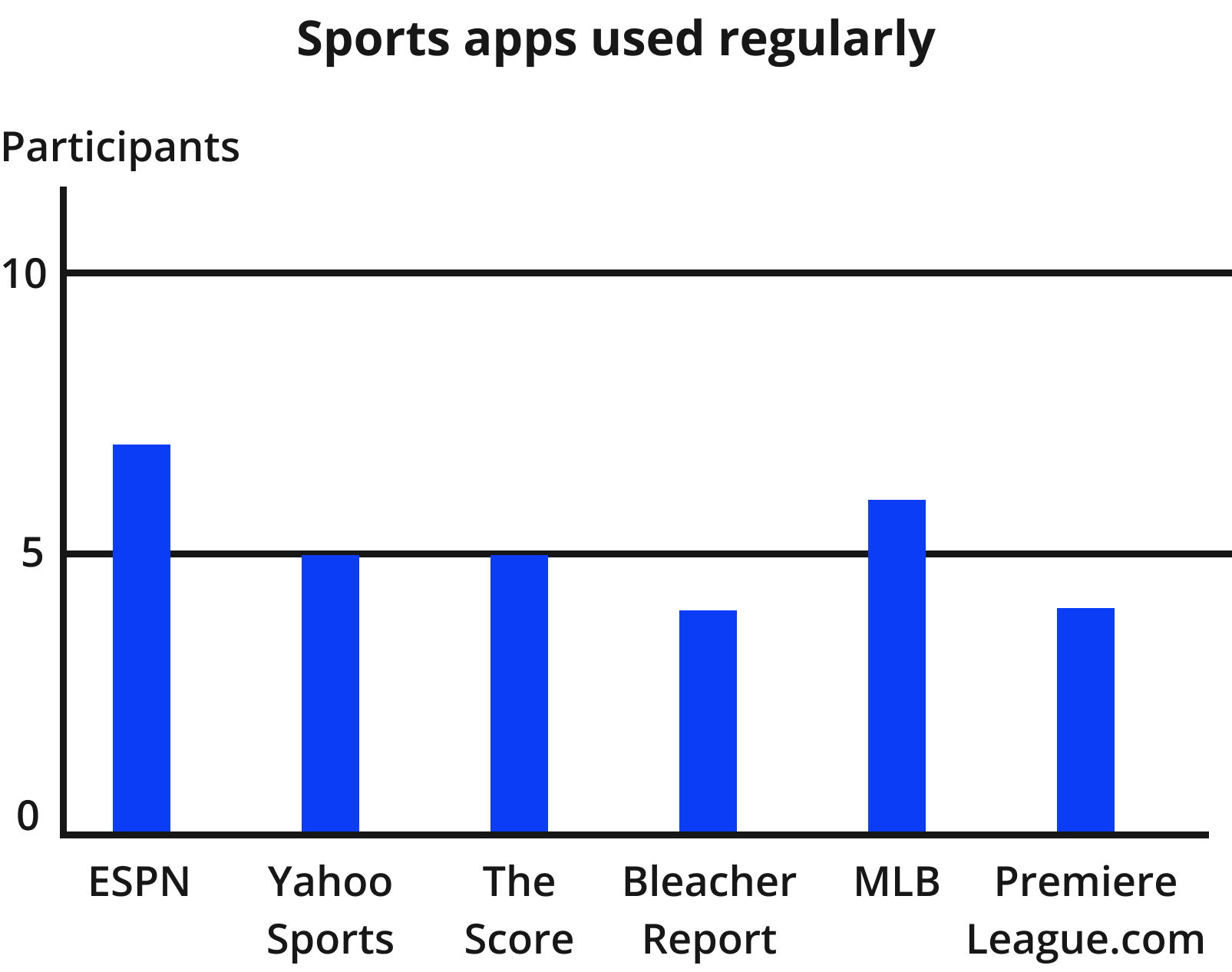
50% of survey participants use multiple sports apps for team and player information.
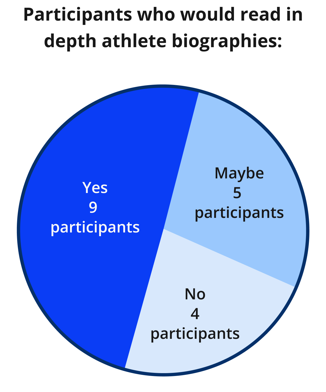
Over 50% would read in-depth player biographies.
See the full analysis matrix here.
Users would like more personal athlete and coach interviews and other “fan to team/ player interactions.”
Synthesizing the research
Before moving forward, I created a goals diagram to not only consider the users needs and wants but to also examine the relavent business goals and technical viability.
The new feature must be:
Intuitive.
Improve the efficiency and ease of finding the new more comprehensive player biographies.
The creation of “Problem Statements”, “How might we” questions, personas and user stories, revealed the following:
How can we reduce the path to get the needed information more quickly and increase user flexibility and efficiency?
From conclusions to actionable results
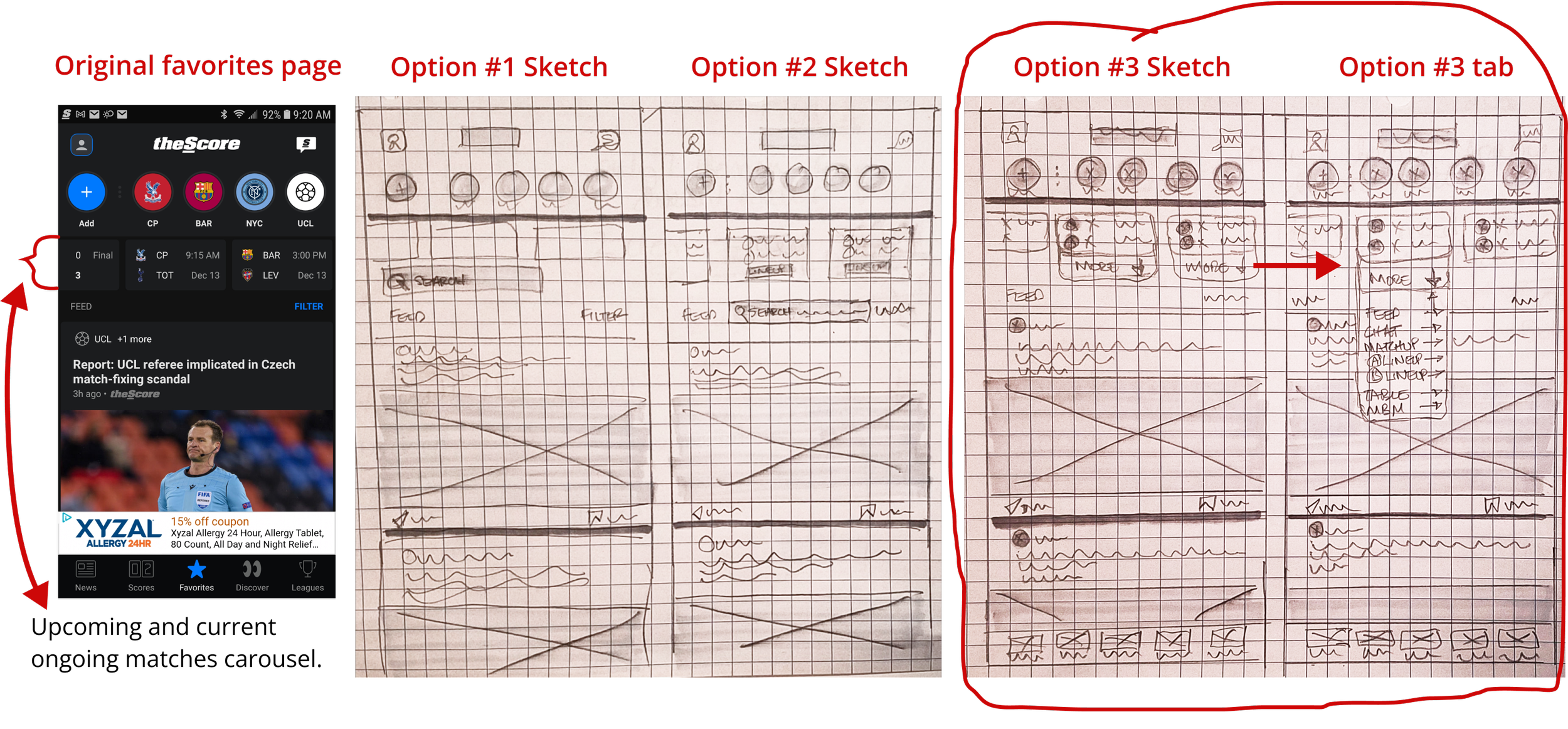
To solve the problem of adding the athlete biographies with the quickest access, I first created a site map of the current “favorites” page (landing page of a current user.)
Sketching, brainstorming and generating ideas
Now I could proceed with wireflows and wireframe sketching to ideate options that achieve quick access to the new screens and update the existing screens involved.
When sketching the balance of the pages for the journey, I went back to the competitors for reference and user expectations:
What are they doing on similar pages?
What information are they highlighting?
How are they presenting the content?
Proposed solutions
When digitizing the wireframe sketches, I followed the existing brand elements, colors, carousels for statistics, etc. while adjusting the existing screens for a simpler journey.
Testing the solution
The medium fidelity prototype included extra snipped pages to give users a more uniform look when discovering the correct path during testing.
The user’s task was to find information about a player during an ongoing match.
Moderated in-person and Zoom testing produced mixed results.
An unmoderated Maze test for the Design Lab slack community recieved seven participants.
These results confirmed the same confusion as my other testers. The “more tab” was a problem.
The results also gave me insights into my organization and content labelling.
Testing Insights, iterations and retesting.
I retested several iterations and had in depth discussions regarding sports “terminology” with one of my original testers.
This process also directly led to a more integrated and consistent look for the final UI.
Problem #1
Dropdown menu label
Solution
Problem #2
Player tab labels
Solution
More iterations and implementing the UI
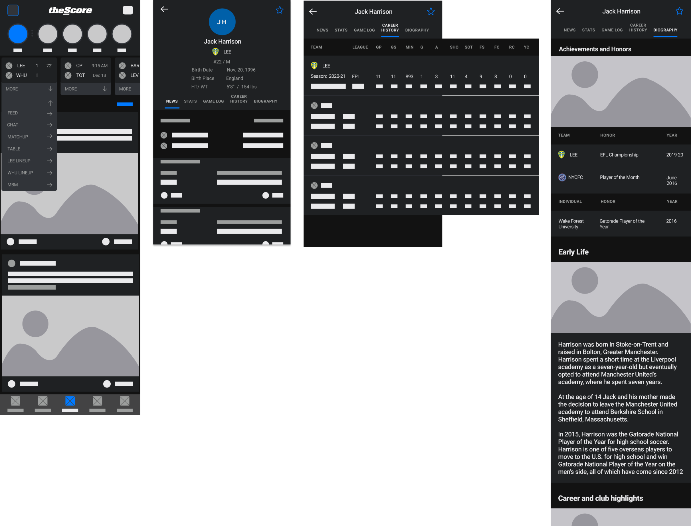
The final high-fidelity prototype features additional screenshots for all possible pages in the path of the task:
Finding player information during an ongoing match.
Find out more about Jack Harrison’s personal and professional life.
A few points stuck with me at the end of this project.
I should have trusted my instincts regarding the more efficient path to the new feature pages.
The drop down menu for all options only confused the user.
Multiple prototype options could be A/B tested.
Working within an existing brand involves as much attention as starting a project from scratch.
After analyzing the app closely for days, I discovered many little design details that I hadn’t originally noticed.
Apps can be extremely complicated, deep and information heavy!
I only worked on one small area of this app within one sport!
Using only a survey in my initial research process made the project more difficult.
Previously I had developed a better understanding of users’ behaviors and needs through interviews.
The Next Steps…
Iteration to finalize efficiency and usability of the new features.
Retesting for efficiency and usability of iterations.
Confirm both existing and potential users desire and use the new feature pages.
Design the balance of the new pages for all sports covered by theScore.
Ensure all accessibility guidelines are met and usability is easy and efficient for affected users.
Confirmation by all stakeholders that new features are:
Within budget.
Will increase user engagement and therefore advertising sales.
Will increase cross-user engagement to partner app.
Work within sports’ timetables for adding the new content.
Content upkeep is manageable.


